Book Review: Designing Interfaces
Filed under Programming, Reviews, Software
I recently finished reading “Designing Interfaces” by Jenifer Tidwell.
I think of this book as “Design Patterns” for user interfaces.
If this book was required reading for everybody that builds software, we’d have *much* better software and happier users. It has really changed how I approach creating user interfaces.
Before reading this book, I could point to an application and tell you if it looks professional and polished or not. Now I can tell you why.
This book deals with many subtleties and attention to detail that can have a huge impact on the user’s impression of your software.
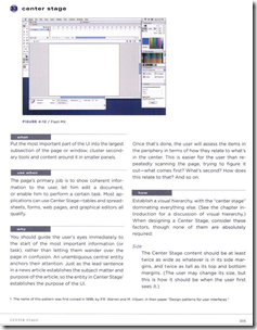
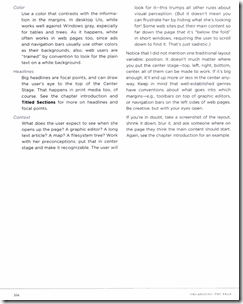
Here is an example pattern, “Center Stage”…
A “preview” of the book is available online (with large chunks missing so you still need to buy it) here.
Highly recommended!


Comments (5)
I haven't read this, but i'll check it out!
I have always recommended Alan Cooper's book, About Face. (Third edition here: http://www.amazon.com/About-Face-Essentials-Interaction-Design/dp/0470084111/ref=pd_sim_b_njs_4
Back when we were both at MPI, after i FINALLY got my head around most of what was going on there, i firmly believed that our GUI interface, needed a GUI.
I'd be curious, after reading this book, how you would remake the interface?
Russ
Posted by Russ Urquhart | December 15, 2008 12:21 PM
Posted on December 15, 2008 12:21
I'm guessing you are talking about Vega Prime LynX, right?
The GUI there is tough...because it was designed to reflect the underlying Vega Prime API.
Our target user is somebody that knows how to code in Vega Prime, so the GUI is supposed to be a natural extension of that. We wanted the GUI to help teach how to write code in Vega Prime. Here is a screen shot of LynX.
We would have done it completely different if were were going for ease of use.
We actually at one point had a completely procedurally generated GUI. That way, as new API calls were created, you got the GUI for free. It made our lives as developers easy because we could focus on the API. However, a procedurally generated GUI was very difficult for users to understand. So we dumped the procedurally generated idea and went with layouts done by hand.
Posted by David | December 15, 2008 9:43 PM
Posted on December 15, 2008 21:43
Certainly Vega Prime is a developers tool, and as such the interface should reflect that. I always felt that, the GUI interface, such as it was, could have done a little more for the developer. (It didn't do much more than the command line interface below it.) As i recall, there were still a lot of values that you had to know before hand, and know their relevance, when you entered them in the GUI interface. I think some of those things, wrt the application being developed, the GUI could have helped more.
Having read the book, how would you change the experience for a developer as a user?
Posted by Russ Urquhart | December 16, 2008 8:35 AM
Posted on December 16, 2008 08:35
I don't think you were around for this, but we couldn't even get resources for an artist to design our icons...which we really wanted for a consistent look and feel. I think the icons are all mine, i.e. programmer art with zero time scheduled to work on them.
One cool feature we added to aid the user was the text for every option was a hyperlink to the documentation for that option. If people couldn't understand our software, then it was the documentation groups fault. ;)
Based on what I read, this is what I would do differently now:
Find out what the users liked about our previous software and keep that. Find out what they didn't like and improve that.
Learn about who the users are. I assumed they were Vega Prime programmers...but maybe most people that use the GUI know nothing about programming. Getting some concrete numbers would show what the right direction is instead of guessing.
Analyze how users interact with the software. Find out what they do the most and make that the most accessible part and conversely, move less important things out of the way.
Posted by David | December 16, 2008 9:18 AM
Posted on December 16, 2008 09:18
That's great to hear! I wish more developers would invest the time to try and understand GUI design.
I think your assessment of the user and those things they use most are right on. I would like to add this little nugget i got from the 1st edition of the Cooper book, namely, a good interface can be one that matches, as closely as possible, how the user THINKS the action works. For example, he uses the notion of the brake in our car. The fact that we all can use the brake in all of our driving experiences, across different models of cars means that hardware interface works pretty well. Cooper is of the opinion that this works well because it works similar to how we THINK a brake works. I think the way my brake works is that i press on the pedal and it pressess against the wheel and we stop! Now of course, actually, there is more to it, the notion of brake fluid, hydraulics controlling calipers, controlling brake pads, etc. The point is, if the interface for the brakes mimicked the actual workings, would you have a brake fluid graph, with a slider to control the pressure to control the pads? Would that work well? Would it work now, to try and relearn everyone on how brakes ACTUALLY work, so they could better use the interface?
Another of his points, related to this, is when talking with your users, probably the one that has been doing the task the longest, after you ask them how their job works, or maybe instead of, ask them how they would LIKE their job to work. (You can get into trouble mimicking a metaphor TOO much.)
Keep up the good work!
Russ
Posted by Russ Urquhart | December 16, 2008 10:42 AM
Posted on December 16, 2008 10:42