Windows 7 Gem #1
Filed under Computers, Software

The most obvious change in Windows 7 is the new taskbar (a.k.a. “superbar”).
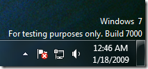
There are a lot of changes with the new taskbar. I’m going to focus on the notification area of the taskbar (the lower right) with this post. The notification area for Windows 7 is pictured above.
The notification area now has a color scheme…
- All normal information is in white
- Problems are in red
- Successful operations are indicated in green
The “sound waves” for the volume indicator were green in Vista, but now they are white in Windows 7 (Vista notification area below).
![]()
The net result: if there is something red/green in the notification area, it really gets your attention.
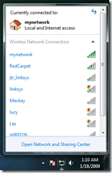
Another nice touch: the network connection indicator shows your Wi-Fi signal strength instead of the two monitors that light up green on send/receive…much more useful!
If you click on the network connection indicator, you get a popup menu list of networks you can join…
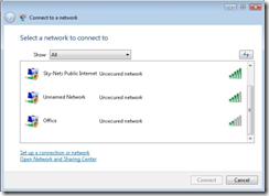
Previously, clicking on the network connection indicator took you to a dialog…
The popup in Windows 7 saves you from opening a dialog. One less mouse click for everybody.
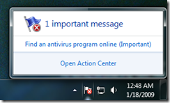
All problems that need your attention go with the white flag (“Action Center”). This means the notification area will stay minimal, even with many applications running (if they all use the Action Center like they should).
I turned on virus software monitoring and this is what the notification area looks like now…
If you click on the flag, you get this…
The clock now has the date! Previously, you had to hover over the time to get the date.
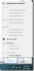
Safely Remove Hardware is hidden under the popup menu on the left end of the notification area.
Instead of opening an additional dialog (which requires pressing “Close” when you are done), you now get a simple popup menu. Again, a UI change that reduces the number of mouse clicks to accomplish a task.
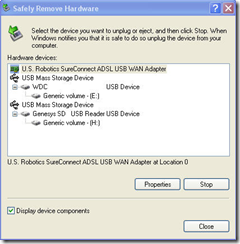
The list is much easier to read now since each item has unique identifiable names (previously, everything was called “USB Mass Storage Device”). The old Safely Remove Hardware dialog is here…
All very subtle changes, but they add up to improve your experience.
